Sustainabite
SUSTAIN-A-BITE is a Horizon Europe project developing affordable, resource-efficient processing solutions for healthier and more sustainable plant-based foods. The project combines food science, technology and consumer research to improve nutritional quality while reducing the energy and water required for production.
I joined the project after its launch, taking responsibility for maintaining and evolving its communication. My role includes planning, producing and analysing content, managing its digital presence and translating ongoing scientific developments into clear and engaging stories.
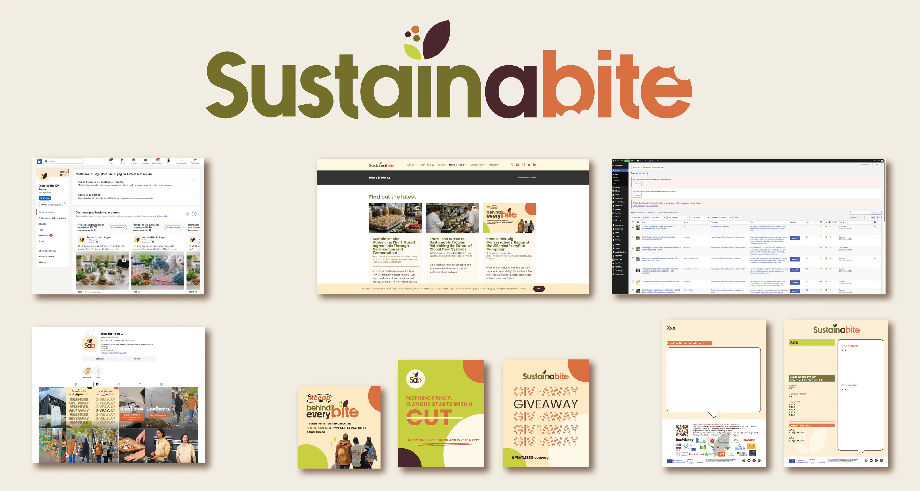
Managing an active European project requires continuous coordination. I work closely with research and industry partners to gather information, identify communication opportunities, manage reviews and approvals, and keep content aligned with the project’s objectives.
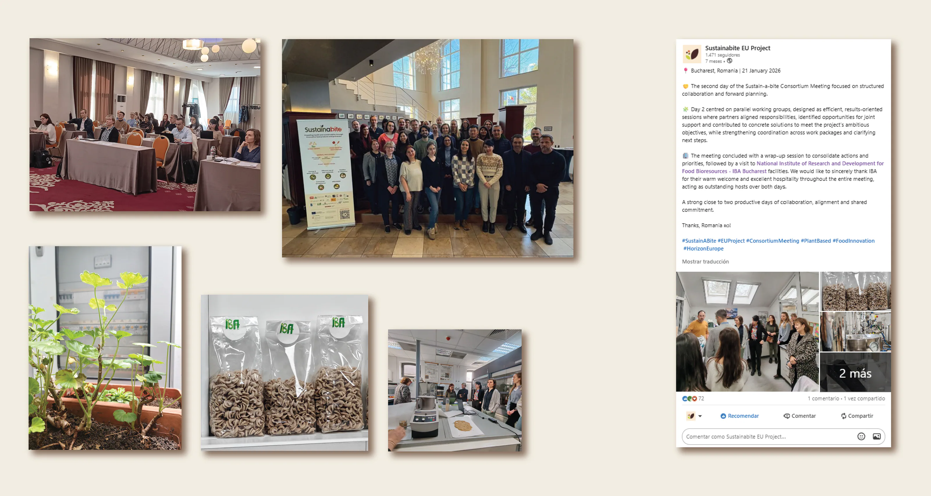
The impact of my work lies in keeping SUSTAIN-A-BITE visible, active and relevant throughout its development. Through consistent content production, partner coordination and performance analysis, I help sustain its public presence and ensure that new results become meaningful communication opportunities.
19
Institutions coordinated
+50
audiovisual materials
+45k
Impressions
+400
Unique users